The Art of Whisky – what makes a beautiful bottle?
Whether you’re a whisky collector or a drinker, a whisky’s looks are important. Beyond its colour and how it looks in the glass, there’s the packaging. While we are focused on finding whiskies that taste great, we also like it if they look great, too.
We’ve been thinking a lot about labels recently thanks to the launch of our Johnnie Walker personalised label service. But what makes a great label? We decided to ask an expert.
Raj Chavda is The Whisky Exchange’s creative director and designer of some of the most striking whisky labels of recent times. We sat down with him to look at some of his favourite whisky bottles – both those that he created and others that have inspired him.
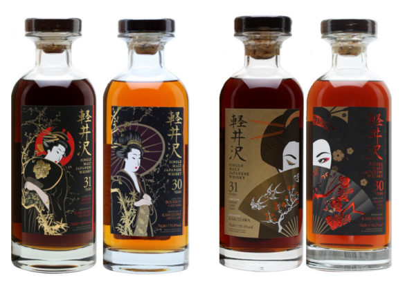
For me, geisha are truly some of the most beautiful forms of Japanese art – it is this thought that I wanted to capture. The idea behind having her with her eyes open on the first release and closed on the second is that when combined, she will be winking at you.
GLENFIDDICH SPECIAL
This label combines an elegant use of space, positioning and composition with a vintage typographic style that epitomises the era. It has real honesty and charm about it. [As of posting, we still have a few bottles of Glenfiddich Special available].
MACALLAN PRIVATE EYE
I love this Macallan bottling for the 35th anniversary of Private Eye magazine by legendary artist Ralph Steadman. He uses his trademark series of ink blotches and a tangle of lines to form this surreal illustration.
COMPASS BOX THE CIRCUS
This beautiful bottle encompasses the charm of vintage circus art combined with complex print embellishments.
GLENLOSSIE 1966 THE COSTUMES
This whisky is part of a legendary Moon Import collection. Both The Costumes and The Birds series incorporate classical typography with copper-plate engravings: a style from old works from the early 1800s.